The Home Depot
|
This is a classic story about the tensions at play when working to satisfy both business objectives and user needs. Our team was given the task to design a mobile app, but after conducting research and identifying the real problem, we found that users would not go for an app; instead, the better course of action was to design a responsive website. How did we manage to convince our client and overcome this obstacle? Read on...
|
CONTEXT
The Home Depot is one of the few companies that has an internal fund dedicated to taking care of its associates. The Homer Fund provides grants and scholarships for any associate in need, and relies on staff donations to continue its good work. This year they celebrate 20 years of service and are putting on special events at their offices and stores. The Atlanta corporate office is called the Store Support Center (SSC) and the main users our client wanted the design to target were SSC associates.
THE CHALLENGE
TASK
Design a mobile app for client's internal charity, The Homer Fund, with the primary goal of increasing associate engagement with, and donations to, the fund.
TIMELINE
3-week design sprint
DELIVERABLES
Design a mobile app for client's internal charity, The Homer Fund, with the primary goal of increasing associate engagement with, and donations to, the fund.
TIMELINE
3-week design sprint
DELIVERABLES
- Extensive user research
- Personas & user journeys
- User flows
- Wireframe prototype tested on multiple users
- High fidelity digital MVP prototype
- Presentation to the client
MY ROLE
I worked on a team of four, and was responsible for:
User Interviews
Ideation & Synthesis
User Flows
Prototyping
Mockups
User Interviews
Ideation & Synthesis
User Flows
Prototyping
Mockups
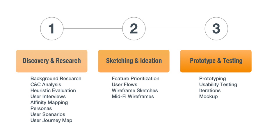
DISCOVERY & RESEARCH
RESEARCH GOALS
We began the discovery phase by brainstorming and prioritizing research goals. The main questions we wanted answered were:
CURRENT OFFERING
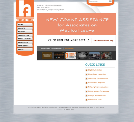
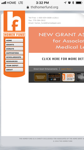
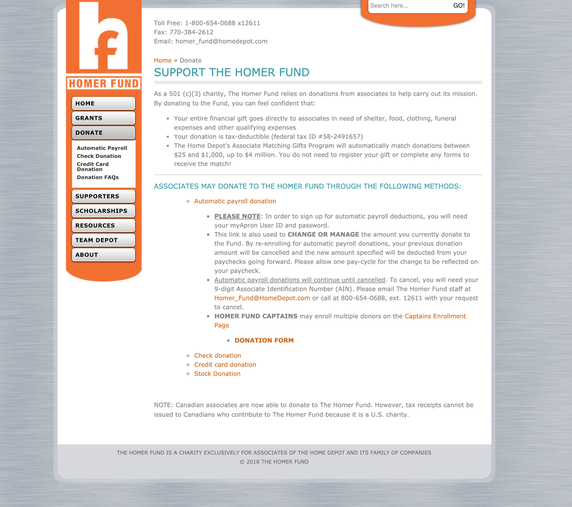
We discovered that The Homer Fund has a non-responsive website, and began by conducting a heuristic evaluation.
We began the discovery phase by brainstorming and prioritizing research goals. The main questions we wanted answered were:
- What is The Homer Fund's current digital offering?
- What can we learn from other leading non-profit charities?
- How are associates currently engaging with The Homer Fund? What are their pain points?
- How could we simplify and improve their experience to increase engagement?
- Is a mobile app the best product to design for this challenge?
CURRENT OFFERING
We discovered that The Homer Fund has a non-responsive website, and began by conducting a heuristic evaluation.
KEY USABILITY TAKEAWAYS
- The language is relatively easy to understand and matches real world conventions.
- Consistency and standards need improvement; when one clicks the "Supporters" link, it takes them to a very different looking page that doesn't match the aesthetics or layout.
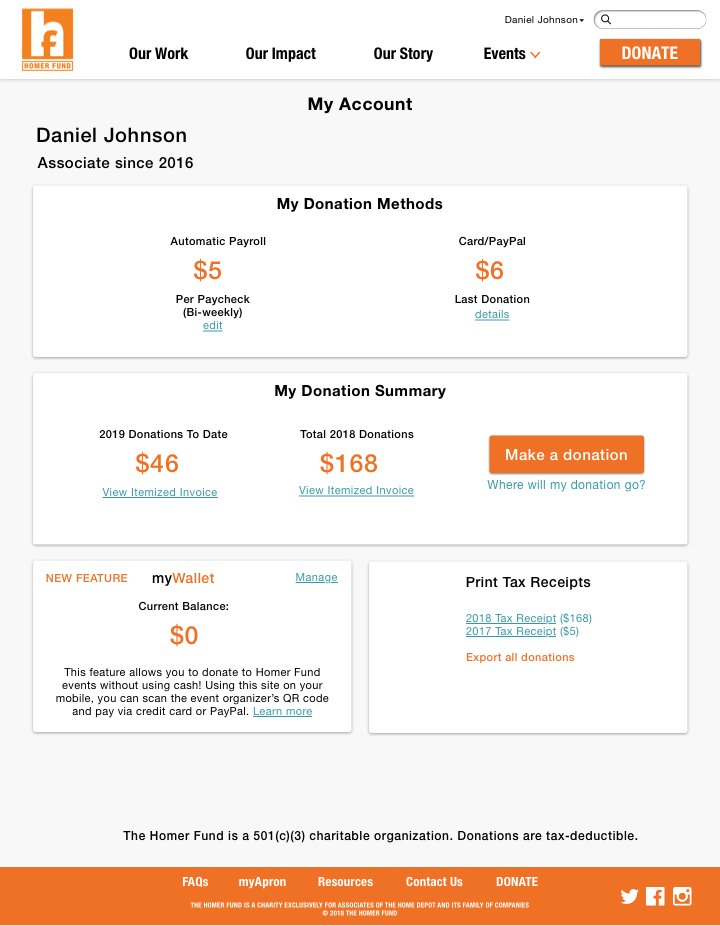
- There is no account page for users to view or update their automatic payroll donations.
- There could be more contrast and prioritization of content (i.e. making "Donate" stand out more).
- The aesthetics are outdated and amount of text should be reduced for more minimalist design.
|
USABILITY TESTING ON CURRENT SITE
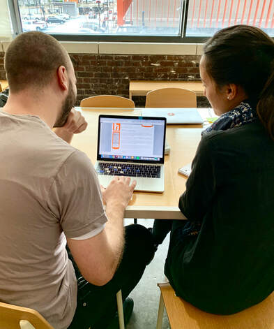
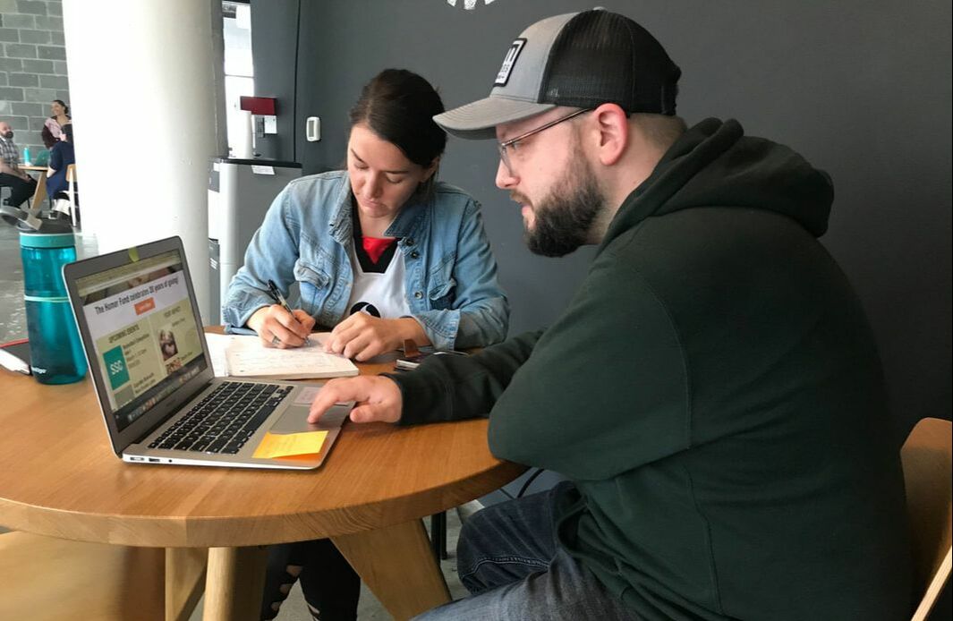
We didn't want to rely solely on our analysis of the site, so we moved into usability testing with participants to see what their experience was. The task I gave was to donate with whichever method the user wanted. I wanted to keep it open-ended to encourage exploration and hear their feedback on different pages. |
|
KEY QUOTES
"There are a lot of words, I don’t know where to click." "I like that details are accessible." "Once you’ve decided to donate, it should be easy with simple steps." "The credit card donation led to PayPal but there’s no clear indication that it’s PayPal on the previous screen." "The logo looks like Facebook and that is really confusing." |
Donate Page
|
INSIGHTS
One user appreciated the amount of details the site offered, while the majority were overwhelmed by the amount of text, as it complicated their donation process. There were some issues with visibility of system status, as one user wanted to donate with credit card, but without warning, was taken to a PayPal site. Lastly, 75% of those tested mentioned a concern about the logo's typography for their "F", as it is very close to Facebook's logo. We kept these findings in mind and noted the importance of a simple donation process for our solution.
One user appreciated the amount of details the site offered, while the majority were overwhelmed by the amount of text, as it complicated their donation process. There were some issues with visibility of system status, as one user wanted to donate with credit card, but without warning, was taken to a PayPal site. Lastly, 75% of those tested mentioned a concern about the logo's typography for their "F", as it is very close to Facebook's logo. We kept these findings in mind and noted the importance of a simple donation process for our solution.
COMPARATIVE ANALYSIS
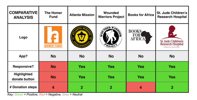
We then compared The Homer Fund with other non-profit charities and found some very interesting insights:
We then compared The Homer Fund with other non-profit charities and found some very interesting insights:
- None of the non-profits in this comparison had an app.
- The Homer Fund was the only one without a responsive website or a highlighted donate button.
- The Homer Fund and Books for Africa both had the longest donation process, with four steps compared to two.
Condensed Comparative Analysis
USER INTERVIEWS
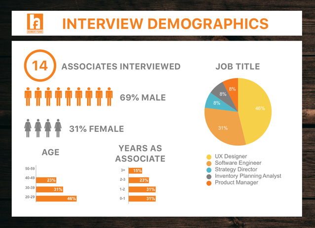
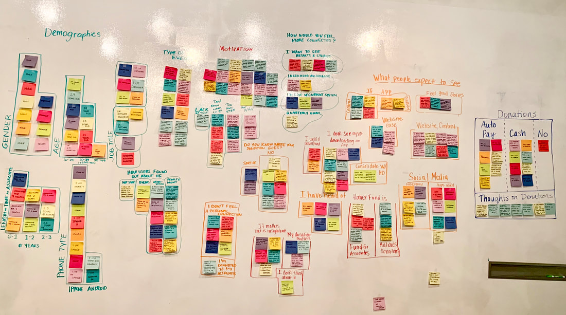
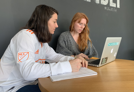
We interviewed 14 Home Depot associates and uncovered some important information that continued to guide our research process.
We interviewed 14 Home Depot associates and uncovered some important information that continued to guide our research process.
|
KEY QUOTES
"I wouldn't use a mobile app. I usually do donations on my desktop because it feels more official to me." "I thought the Homer Fund was pretty cool and moving when I heard about it in orientation, but since then it's gone to the back of my mind and I haven't thought about donating." "I would feel more connected if there was an easily accessible site that had testimonials...if there currently is a website, I'm not completely aware of what it is or where." "The website was not very easy to use. I felt like I had to do a lot of reading, feeling around the website, and clicking to find what I needed." |
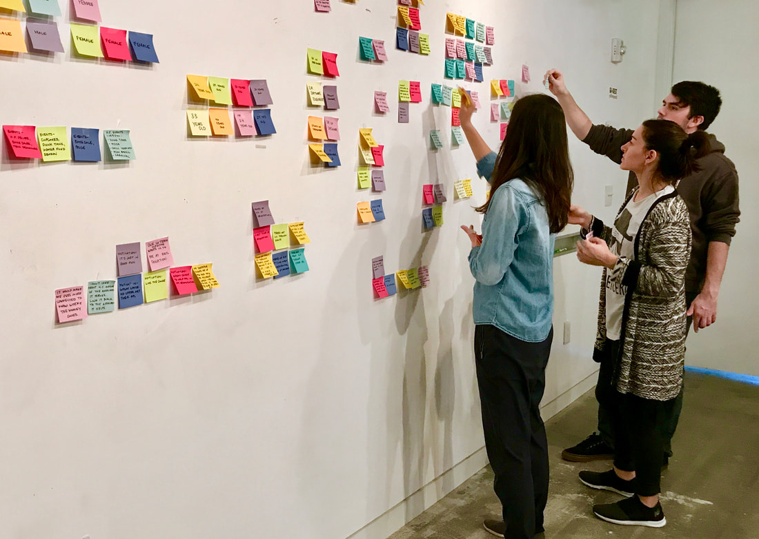
AFFINITY MAPPING
KEY INSIGHTS
The Homer Fund events are all cash-only, and tend to be run by an associate's own initiative. The events span from bake sales and ping pong tournaments, to dunk tanks and basketball competitions. Associates are quite involved with events, but often will find out the day of the event. Each spring, there is a special Homer Fund campaign, where the company puts on bigger events and associates receive a push to donate.
The Homer Fund events are all cash-only, and tend to be run by an associate's own initiative. The events span from bake sales and ping pong tournaments, to dunk tanks and basketball competitions. Associates are quite involved with events, but often will find out the day of the event. Each spring, there is a special Homer Fund campaign, where the company puts on bigger events and associates receive a push to donate.
- 100% of associates interviewed have heard of The Homer Fund.
- 92% have donated before or currently donate (by cash or automatic payroll deduction).
- Only 8% feel a personal connection to The Homer Fund.
- 70% want to see where their donations go, as well as impact stories.
- 85% would not download a Homer Fund mobile app.
- Approximately 85% of associates did not know The Homer Fund website existed.
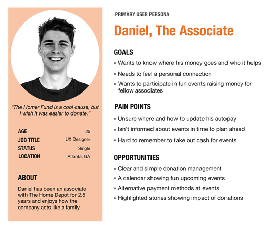
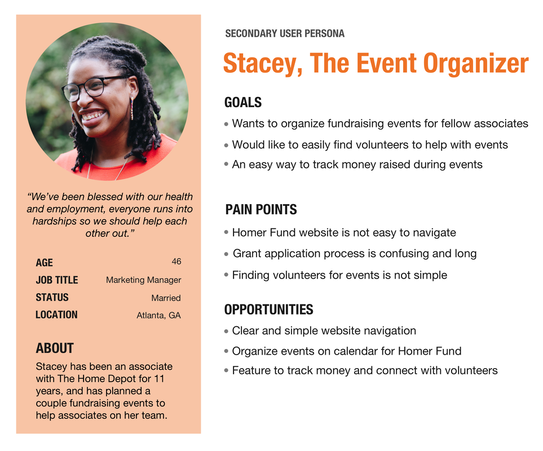
USER PERSONAS
After synthesizing insights from interviews, we created a primary and secondary persona, respectively: The Associate and The Event Organizer.
After synthesizing insights from interviews, we created a primary and secondary persona, respectively: The Associate and The Event Organizer.
THE PROBLEM
Once we analyzed all of the data we had gathered, we were able to identify the real problem at hand:
Home Depot associates know about The Homer Fund; however, we identified the following barriers that prevent further engagement:
Home Depot associates know about The Homer Fund; however, we identified the following barriers that prevent further engagement:
|
(1) poor website usability
(2) a complicated donation process (3) little awareness of impact (4) limited event payment options |
THE PIVOT
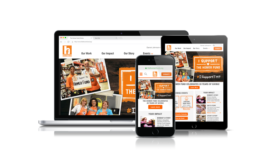
Our client's goal was for us to design a mobile app; however, in order to truly solve this problem, we found that the research conflicted with the initial goal, and a responsive website was the best solution for the following reasons:
We brought this compelling evidence to our client and fortunately, they agreed with our recommendation and supported this new direction.
- 85% of users would not download a mobile app for The Homer Fund.
- No other nonprofit used an app in our analysis.
- The Homer Fund website was the only non-responsive site.
- Google's mobile-first algorithm will bury websites that are not mobile-friendly.
We brought this compelling evidence to our client and fortunately, they agreed with our recommendation and supported this new direction.
THE SOLUTION
If we build a responsive Homer Fund website with an easy donation process, event-planning support, impact stories, and a feature to enable cashless event donations, we expect to see increased engagement and donations that are sustained throughout the year.
PROTOTYPING & TESTING
USABILITY TESTING
We had two rounds of usability testing with a total of 8 participants: the first on mid-fi wireframes, and the second on our higher fidelity mockups.
We had two rounds of usability testing with a total of 8 participants: the first on mid-fi wireframes, and the second on our higher fidelity mockups.
ITERATIONS
Many iterations were made, but I will highlight three:
Many iterations were made, but I will highlight three:
|
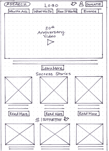
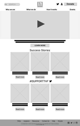
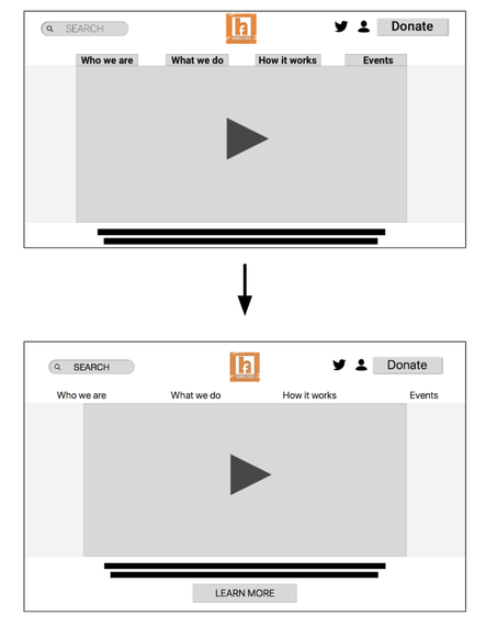
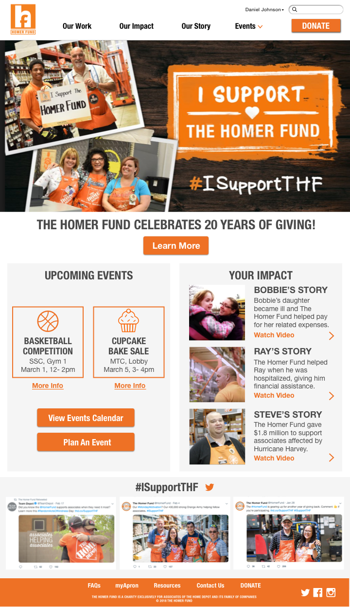
1. Some users thought that the top navigation links were tabs connected to the video, not the menu. We wanted to make that distinction so removed the tab appearance.
|
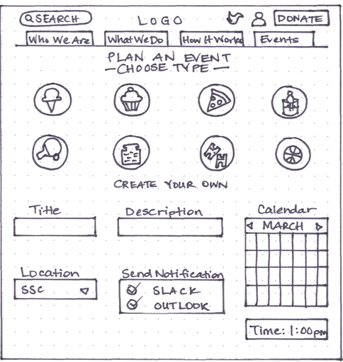
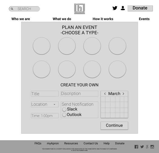
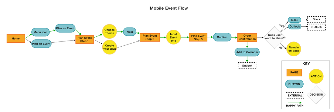
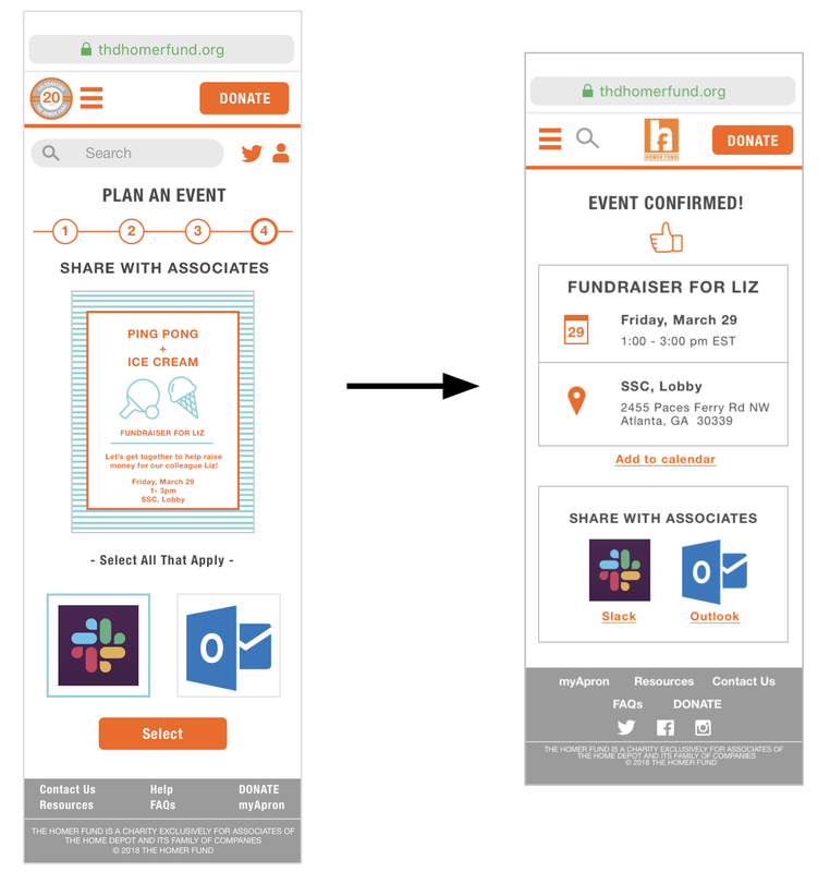
2. In the event planning flow, we originally offered a poster for associates to send out; however, through testing we found that this feature was not well received. Instead, focusing on a calendar appearance to encourage associates to add and share events tested stronger.
|
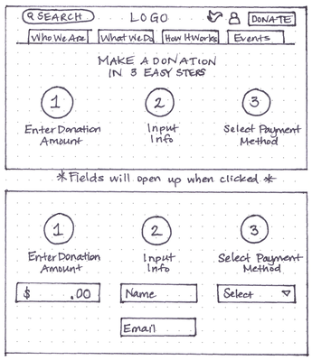
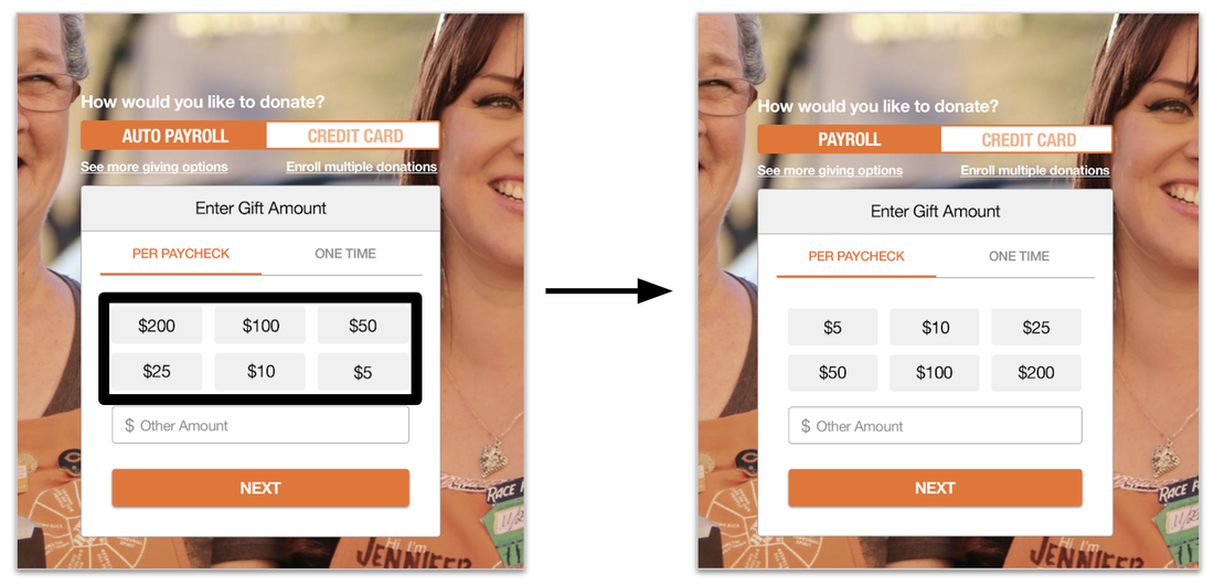
3. I initially designed the donation amounts to start high and descend in order to encourage higher donations. This did not test well, as users felt it was greedy and discouraged giving smaller amounts. Especially since we are designing for younger associates who aren't currently giving large amounts, it made sense to put the smallest amount first.
MOCKUPS
I designed the following mockups, using Sketch.
I designed the following mockups, using Sketch.
Mobile Donation Screens (Automatic Payroll)
MVP PROTOTYPE
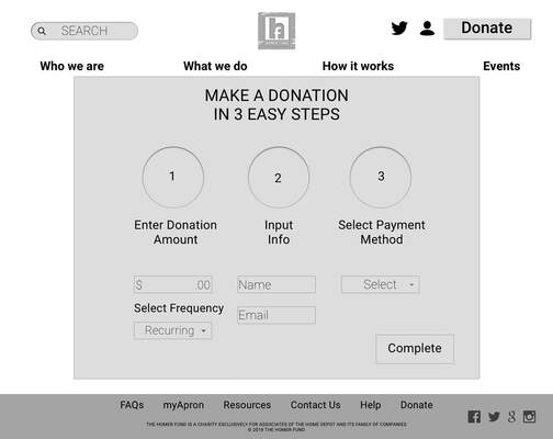
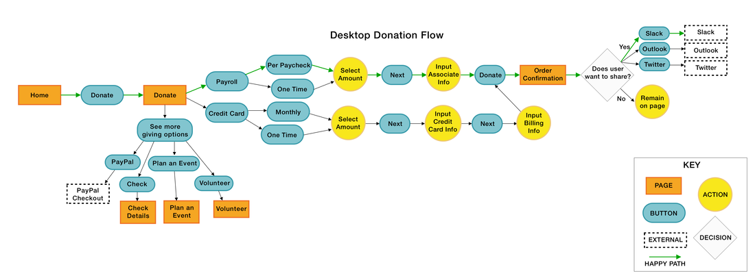
Desktop Donation Feature
Mobile Plan Event Feature
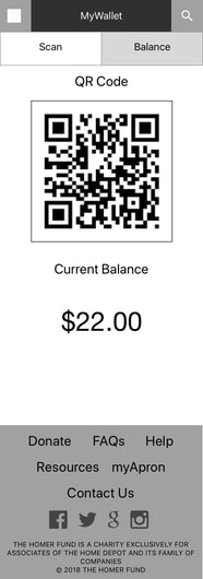
Mobile myWallet Feature
RECOMMENDATIONS
- Explore ways to have digital platforms communicate with each other, so associates can be already logged into their account when entering The Homer Fund website from their employee platform "MyApron".
- Consider updating the logo to avoid confusion with Facebook's logo.
NEXT STEPS
- Build out more screens for desktop, mobile, and tablet
- More usability testing & iterations
- Conduct another design sprint, focusing on the secondary persona’s pain points
- Simplify grant application process
- Solidify volunteer feature
- Design events calendar page
