Recline. by J. Crew
Recline. is a concept project I did, a microsite that sells classic modern home decor tailored to the sophisticated J. Crew customer. I gained a deeper understanding of the e-commerce space and how to design for both user and business goals. I also strengthened my wireframing and prototyping abilities, using Justinmind and InVision software.
CONTEXT
J. Crew, the once iconic American brand, has struggled in sales as many customers have lost interest in their
fashion forward items and lower quality. They recently launched their home collection at the end of 2018 and
are in dire need of a turnaround.
PROBLEM
J. Crew needs a way to market their new online home collection in order to regain customer loyalty, increase conversion rates, and attract the sophisticated working professional.
SOLUTION
I designed the e-commerce microsite Recline. that sells classic modern home decor to the sophisticated J. Crew customer.
MY ROLE
Sole UX Designer
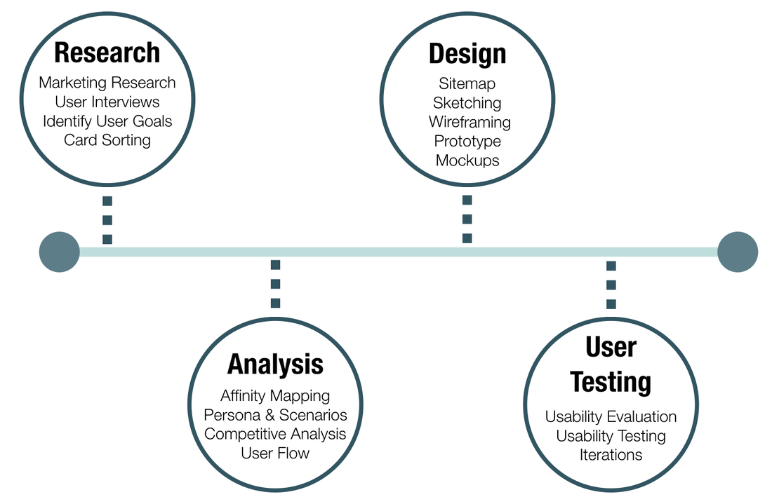
DESIGN PROCESS
To solve this problem, I started by researching J. Crew's business and brand goals, along with their target audience. I was given a persona and then found interview participants who matched the demographic and conducted interviews. I synthesized the findings through affinity mapping and then moved on to information architecture and sketching to design the sitemap, user flows and wireframes. I developed a prototype and conducted usability testing, and concluded by iterating my designs and creating mockups.
|
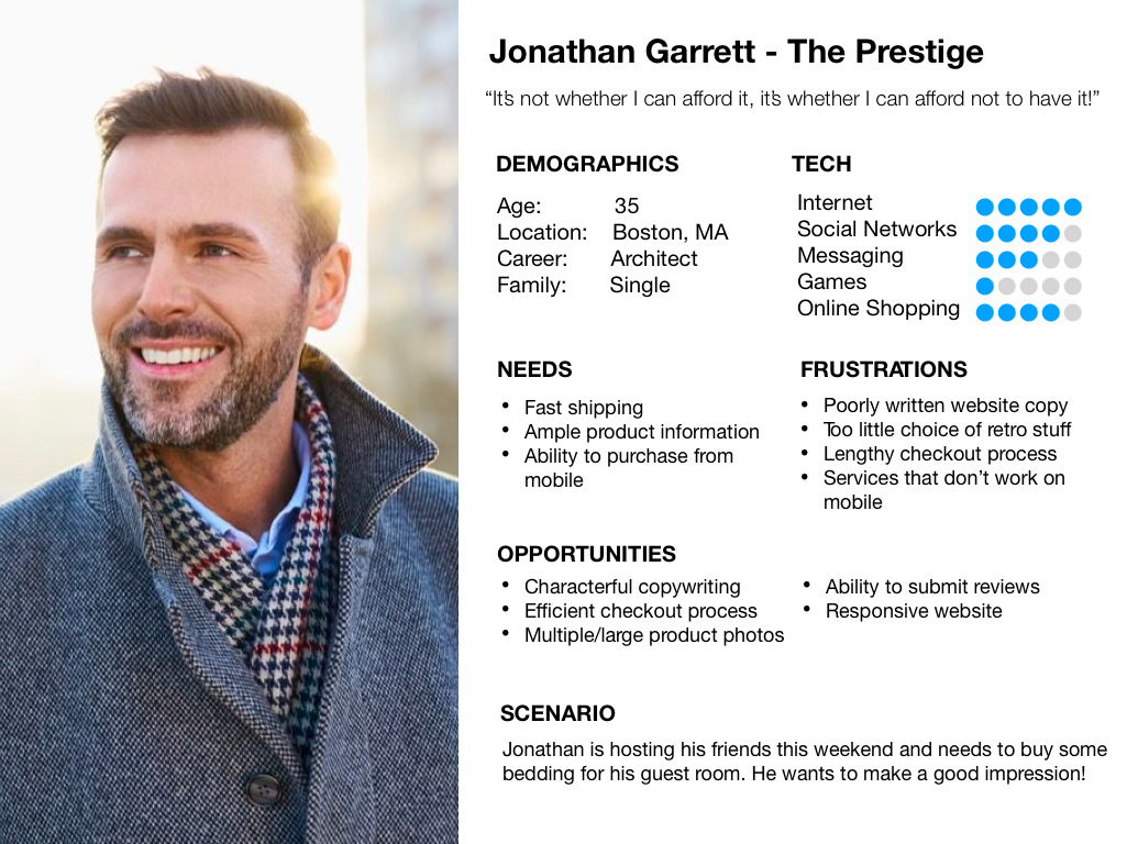
PERSONA
For this project, I was given the following buying persona:
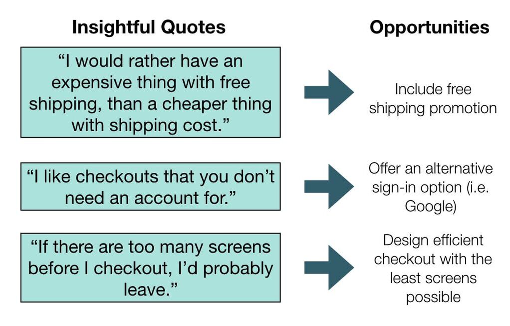
INTERVIEWS
I interviewed 5 users similar to the persona for more insights.
|
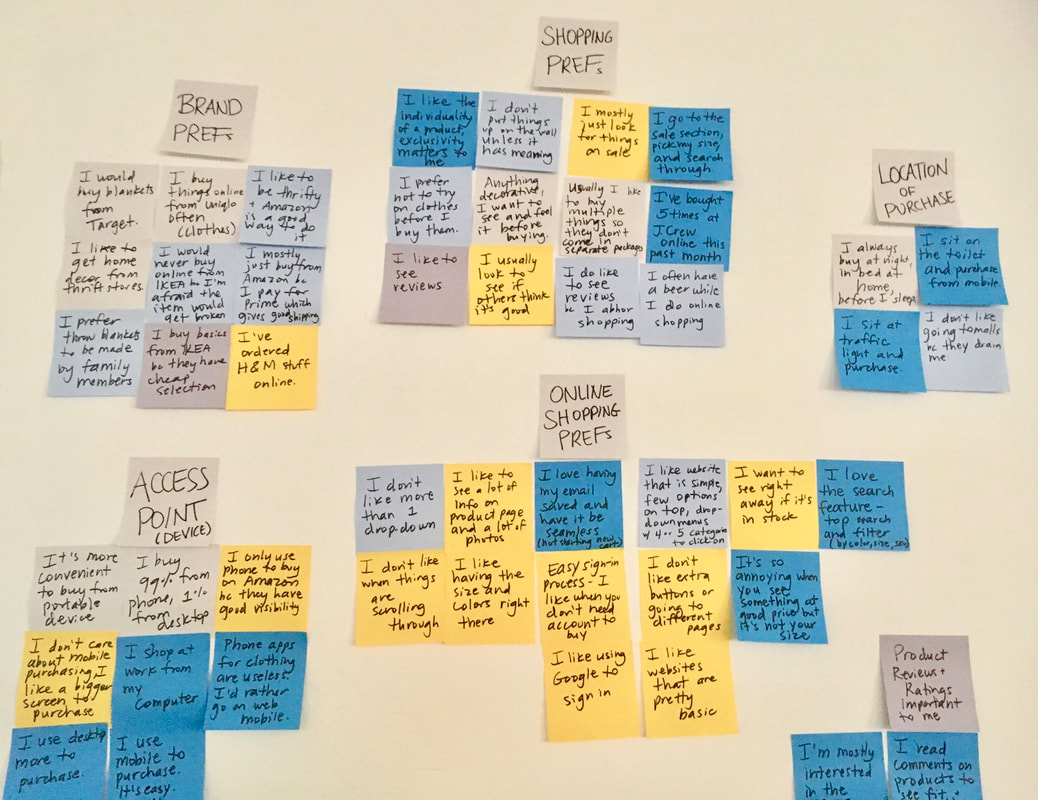
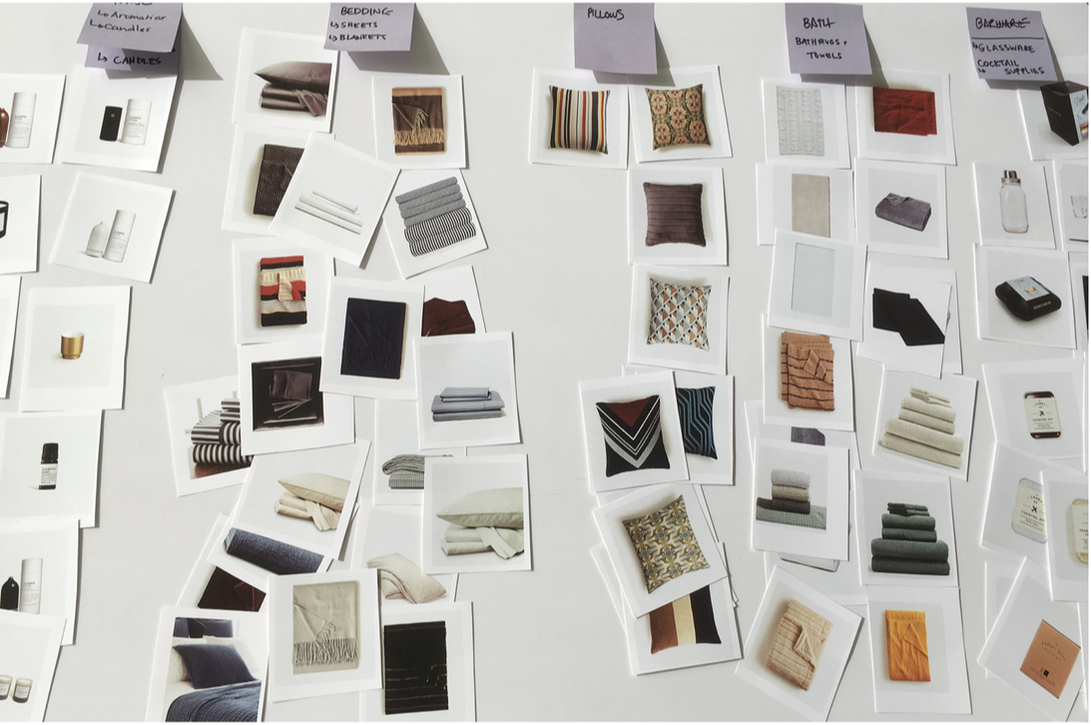
AFFINITY MAPPING
I used affinity mapping to further organize the information from interviews and found that:
- Product reviews and ratings are top importance for users
- Checkout should have the ability to save information and include a guest checkout option
- Majority of users purchase from mobile, but some prefer desktop for bigger screen size
- Users like a simple, clean layout and not too many buttons to press or pages to go through
|
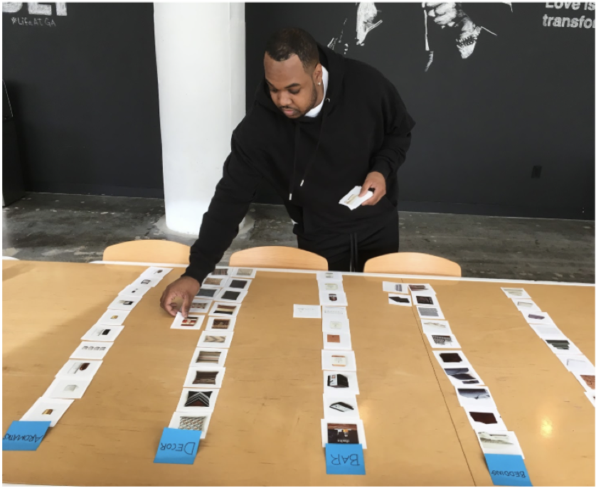
CARD SORTING
I conducted 5 open, and then 5 open/closed card sorts to guide me in selecting the navigation categories and overall information architecture of the microsite. Participants had trouble labelling candle and diffuser products together, so I learned that I either needed to clarify this category or separate them.
|
|
SITEMAP
With the insights from card sorting, I finalized the information architecture of the site and developed a sitemap.
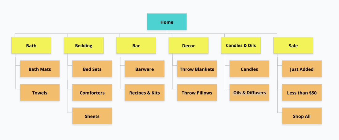
Simplified sitemap
SKETCHES
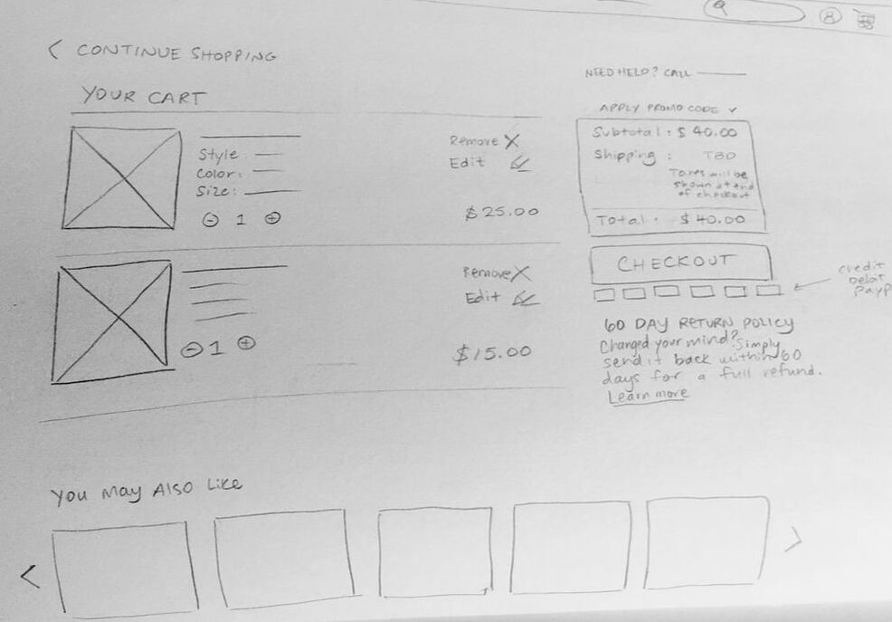
|
|
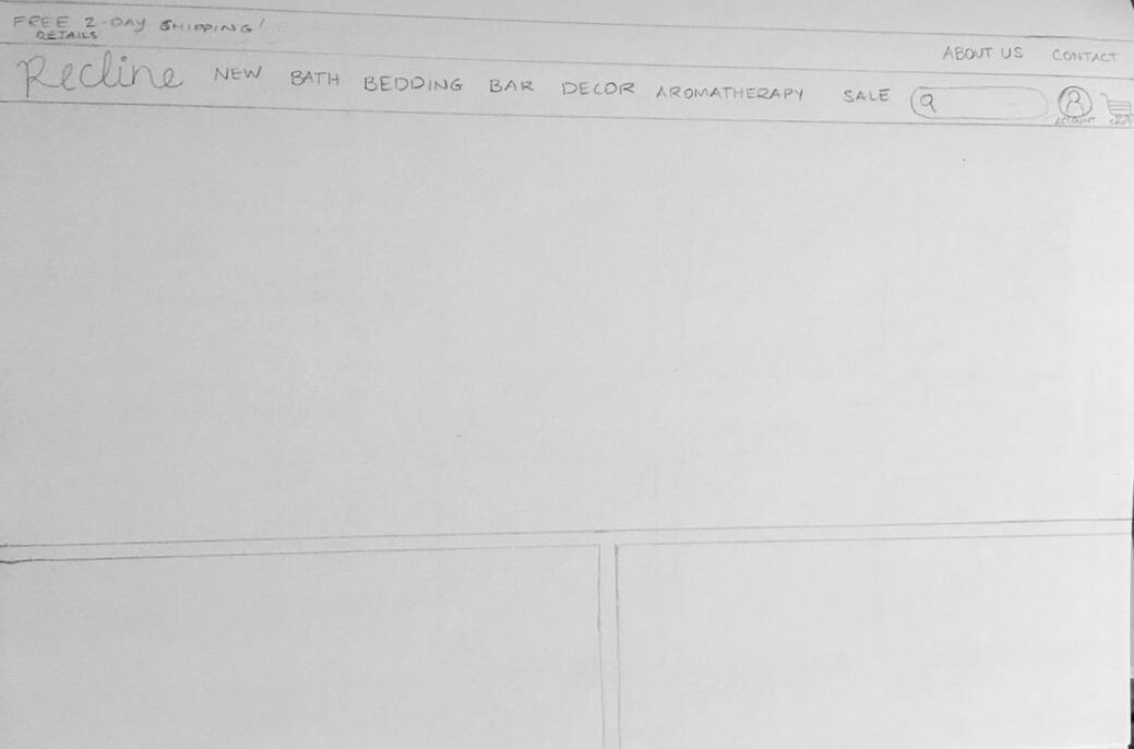
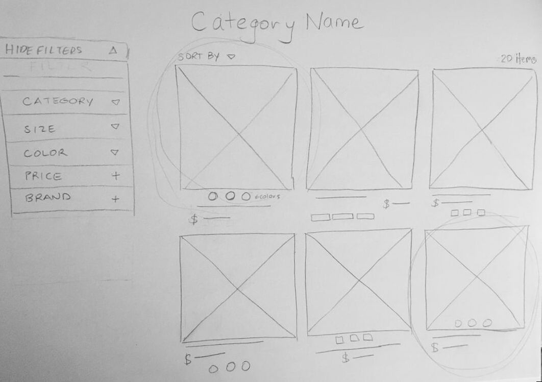
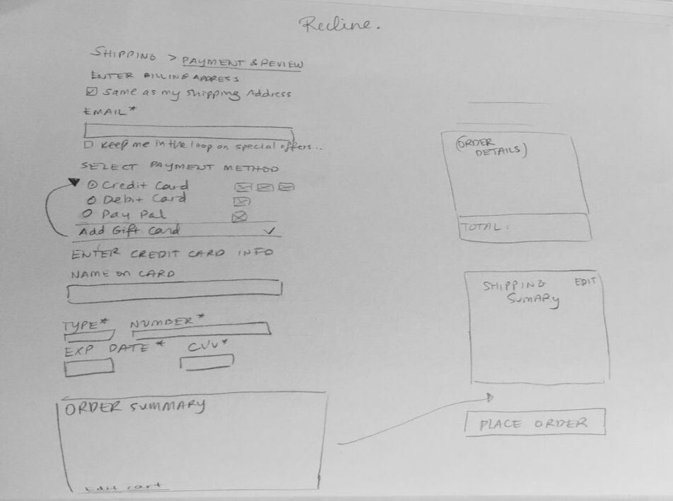
MID-FI WIREFRAMES
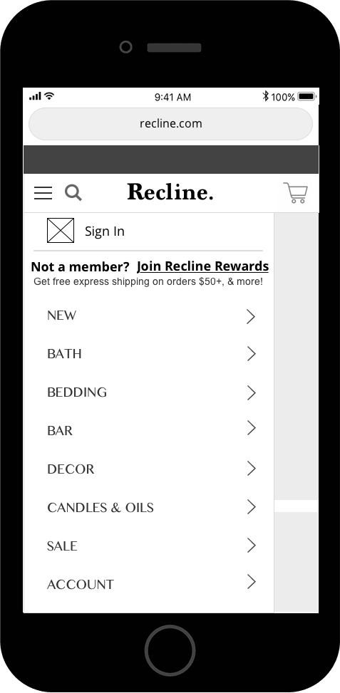
Home page
|
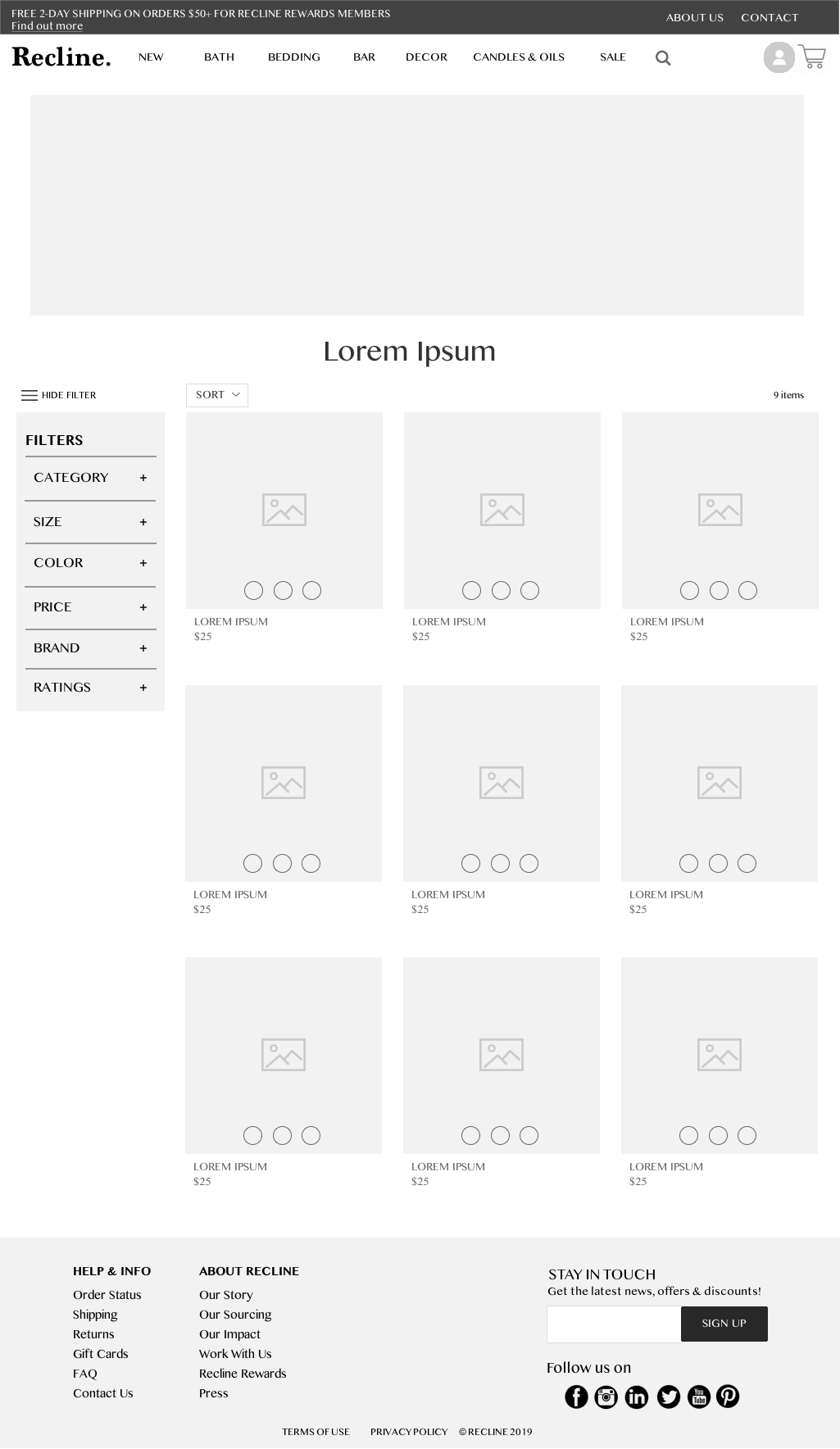
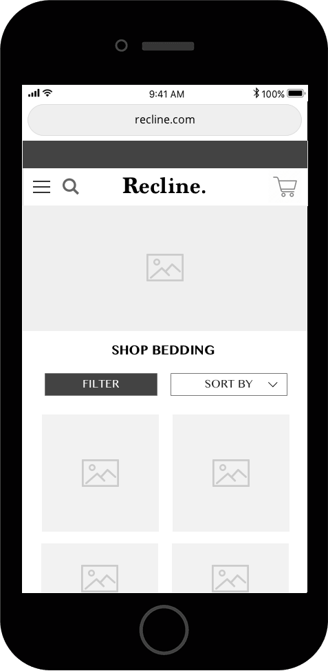
Product listing page
|
USABILITY TESTING
|
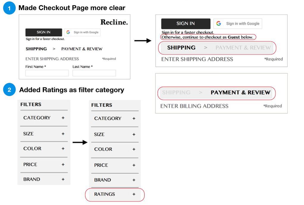
I tested the mid-fi prototype on users and received valuable feedback. One user mentioned he wishes he could filter products by ratings, and several users had confusion during the checkout process of how to check out as a guest.
OPPORTUNITIES
|
|
ITERATIONS
|
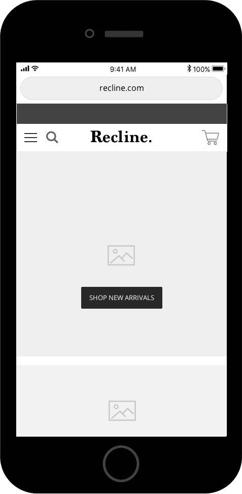
EARLY MVP PROTOTYPE
MOBILE VIEW
|
|
|
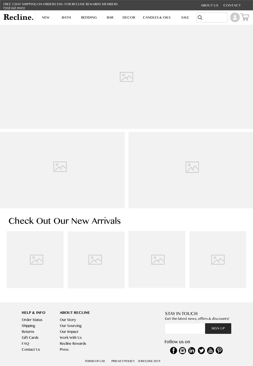
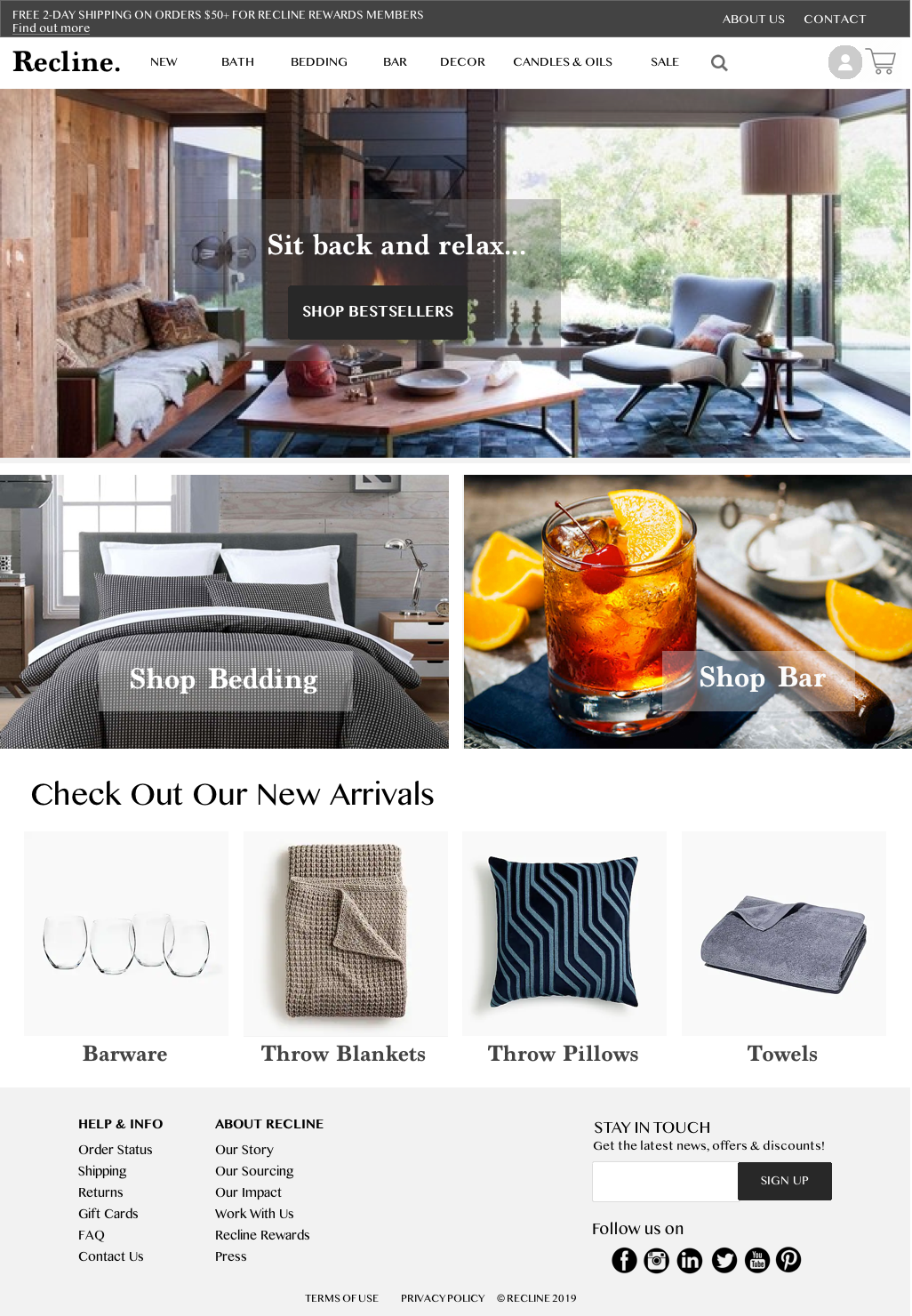
MOCKUP
|
