Fortamus
|
This case study explores working in the startup space as a solo UI/UX Designer and navigating design in a fast moving development cycle. I had the opportunity to work with an innovative InsureTech company seeking to make waves in the insurance industry. They hired me to take their B2B web app vision and wireframes to the next level by designing a seamless user interface that would move the product forward for launching later this year. I was able to work dynamically with the product and business owner, as well as developers and a marketing specialist to complete the project. In this time, I developed my wireframing skills and UI design using multiple design systems.
|

CONTEXT
What is Fortamus?
Founded in 2018 by a small group of data scientists, insurance veterans, and engineers, Fortamus is an InsureTech company that seeks to change the way life insurance is underwritten, marketed, purchased and serviced. The Fortamus platform provides financial advisors access to life insurance products based on individual pricing and real-time valuation, so for the first time, life insurance can be placed within client assets under management (AUM).
Founded in 2018 by a small group of data scientists, insurance veterans, and engineers, Fortamus is an InsureTech company that seeks to change the way life insurance is underwritten, marketed, purchased and serviced. The Fortamus platform provides financial advisors access to life insurance products based on individual pricing and real-time valuation, so for the first time, life insurance can be placed within client assets under management (AUM).
THE CHALLENGE
TASK
Design all aspects of the web app interface using Ant Design System, to get the product ready for market as soon as possible.
TIMELINE
8 weeks, composed of 4 design sprints
DELIVERABLES
Design all aspects of the web app interface using Ant Design System, to get the product ready for market as soon as possible.
TIMELINE
8 weeks, composed of 4 design sprints
DELIVERABLES
- High fidelity wireframes
- InVision prototype
- Mockups
THE TEAM
I was the sole UI/UX Designer, working alongside the Product/Business Owner and Data Scientist, who both also performed front-end development. We also had a Back-end Developer, Marketing Specialist, Recruiter and Chief Financial Officer on the team. I was responsible for:
Information Architecture
UX Strategy
UI Design
Wireframes
Prototyping
Usability Test Planning
Mockups
Information Architecture
UX Strategy
UI Design
Wireframes
Prototyping
Usability Test Planning
Mockups
THE APPROACH
I began my process with a deep dive into research and discovery, asking many questions of the business owner and other team members to learn about the industry, target users, and product vision. I then reviewed the current wireframes as well as user interviews that were conducted with financial advisors earlier this year. I analyzed several enterprise and wealth management platforms that advisors use to gain context and design inspiration.
Following research, I began with form design, strategizing how I could organize form fields for several flows in a simple and intuitive way. I moved on to designing the home page, summary pages, and login flow for both the advisor and client platform. I used Sketch to wireframe and, after several iterations, developed a prototype in InVision.
Following research, I began with form design, strategizing how I could organize form fields for several flows in a simple and intuitive way. I moved on to designing the home page, summary pages, and login flow for both the advisor and client platform. I used Sketch to wireframe and, after several iterations, developed a prototype in InVision.
DISCOVERY & RESEARCH
CURRENT OFFERING

Advisor Login
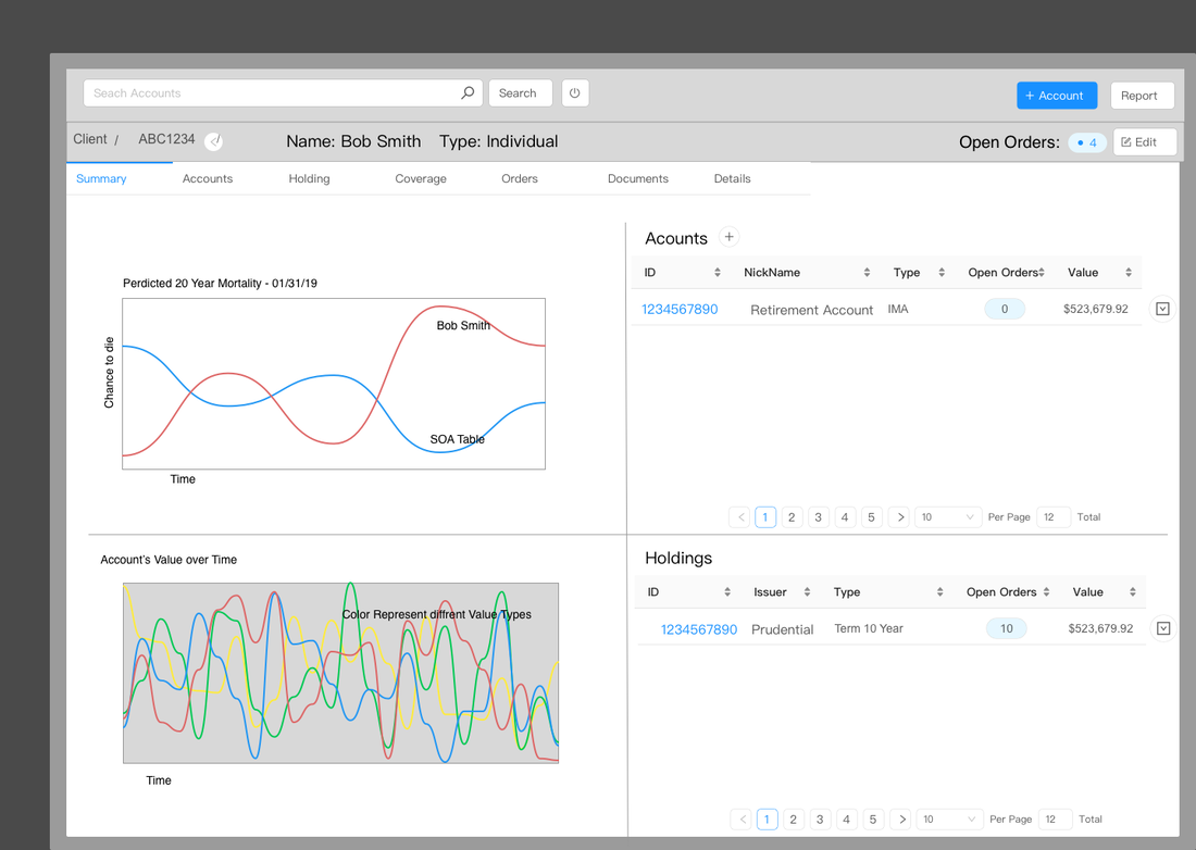
Client Summary
|
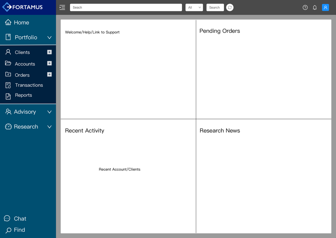
Home
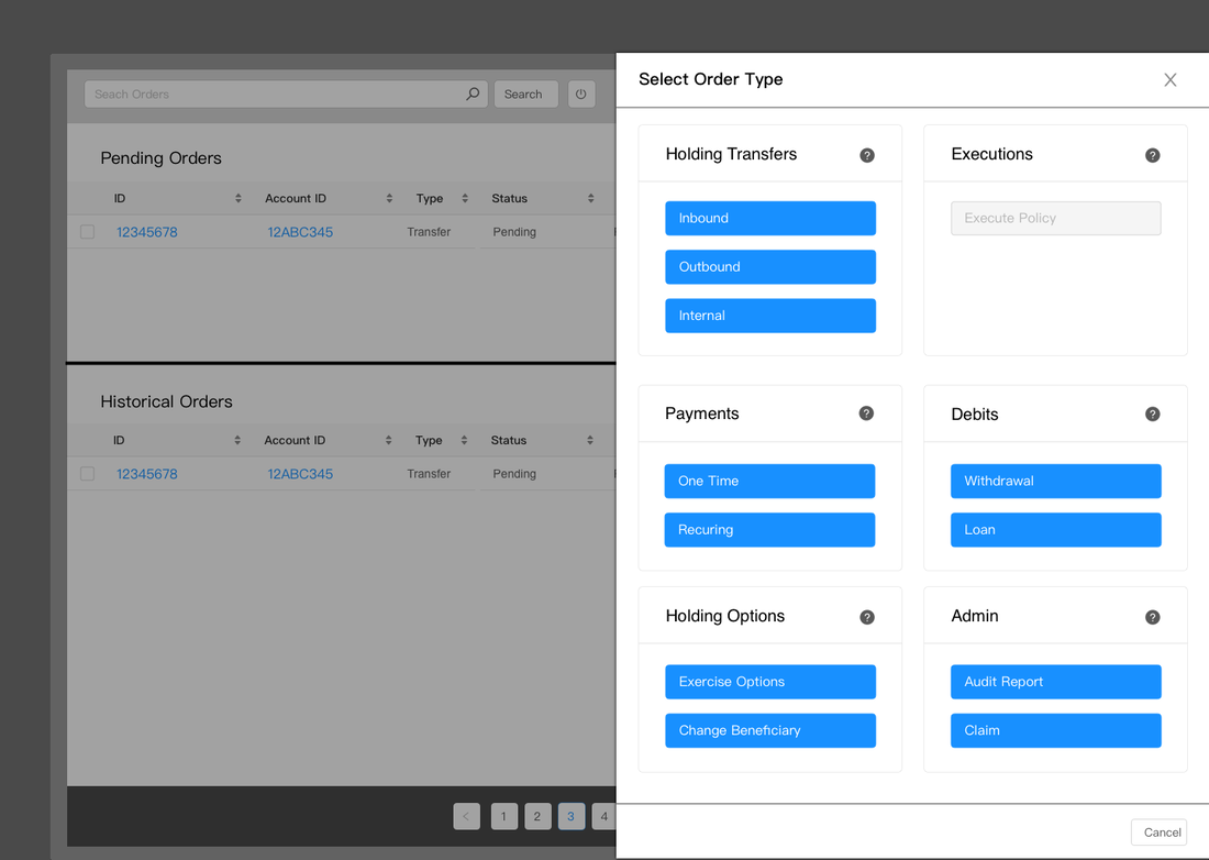
Select Order Type
|
COMPARATIVE ANALYSIS
I compared the web interfaces of Salesforce, Zoho, Redtail, and Wealthbox CRM , and found that:
- The most common overlay for completing tasks was a centered modal
- Zoho was very customizable and had a strongly designed user interface
- Redtail and Wealthbox use a left panel global navigation, while Salesforce and Zoho use a top navigation

USER INTERVIEWS
Months prior to my arrival, Fortamus had conducted 12 interviews with financial advisors (5 female and 7 male). I read and analyzed the interview results, and was able to glean insights into the context and behaviors of our potential users, which informed my design.
Key Insights:
Since advisories can have as many as 400 clients, I learned that I needed the web app to handle a large number of clients and accounts. Also, it was very important to learn that users extended beyond advisors. I needed the experience to be intuitive to administrative staff as well, who may come from a variety of backgrounds and familiarity with insurance. Lastly, knowing how client access works within advisories was crucial in designing different access levels and permissions within the product.
Key Insights:
- Size and type of advisories range greatly
- Some advisors do their own client on-boarding, while in other firms, the Customer Services and/or administrative staff handle this task
- Majority of advisories use a team approach and share client access within teams
Since advisories can have as many as 400 clients, I learned that I needed the web app to handle a large number of clients and accounts. Also, it was very important to learn that users extended beyond advisors. I needed the experience to be intuitive to administrative staff as well, who may come from a variety of backgrounds and familiarity with insurance. Lastly, knowing how client access works within advisories was crucial in designing different access levels and permissions within the product.
DESIGN
For the sake of time, I will focus on one aspect of the project to dig deeper into design and iterations. My first task was to update the "Create a New Account" flow. Below are the old versions of the first two wireframes in the flow:
Create a New Account Step 1/5
|
Create a New Account Step 2/5
|
|
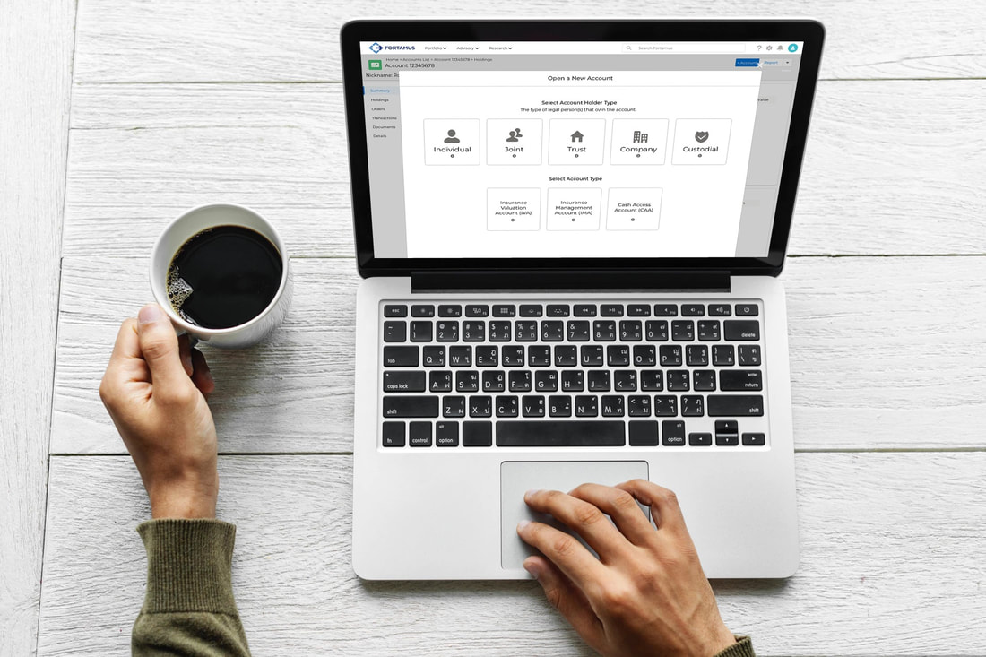
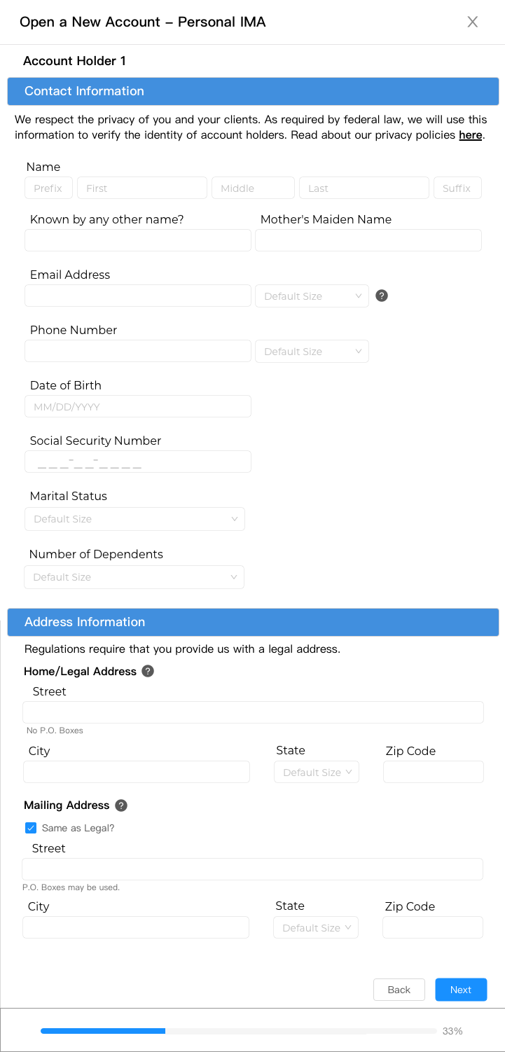
After assessing the current design, the following observations led to iterations: 1. There were many form fields, but no headers to group them. I explored how to organize the fields into sections to make the experience smoother (see photo to the right). 2. The phrase "Create a New Account" was meant for a new financial account, which could be confused with creating a user account. I changed this to "Open a New Account", language more common to financial institutions, to increase clarity and reduce confusion. 3. Form design best practice is to lay out form fields in one single column to help users navigate the form in a more clear and smooth flow. I separated account holders, so the user will input information for one account holder at a time, instead of having them side by side. 4. Help text was needed to guide the user, especially with abbreviations and new concepts Fortamus was coining (i.e. IMA = Insurance Management Account). 5. The naming of steps in the footer progress bar were vague, and the number of steps changed based on individual or multiple account holders. Therefore, we opted for a percentage progress bar that could adapt no matter how many steps there were. |

Information architecture
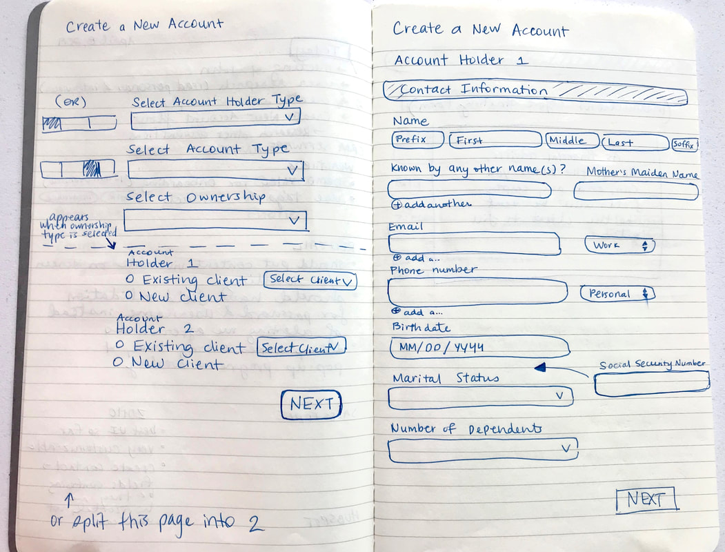
Preliminary sketches
|
REVISED WIREFRAMES
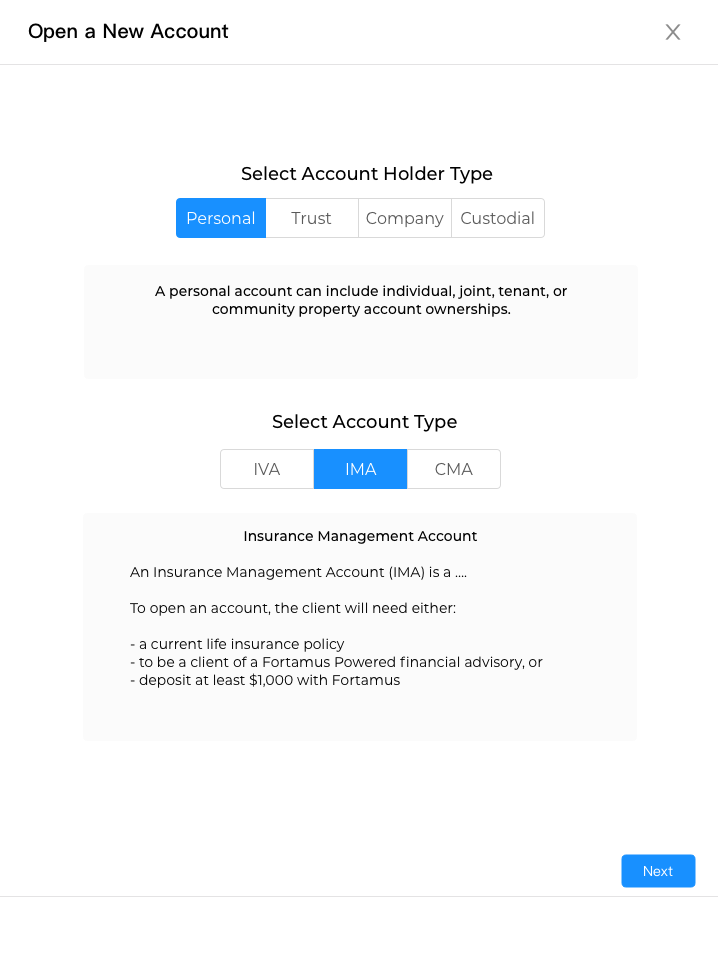
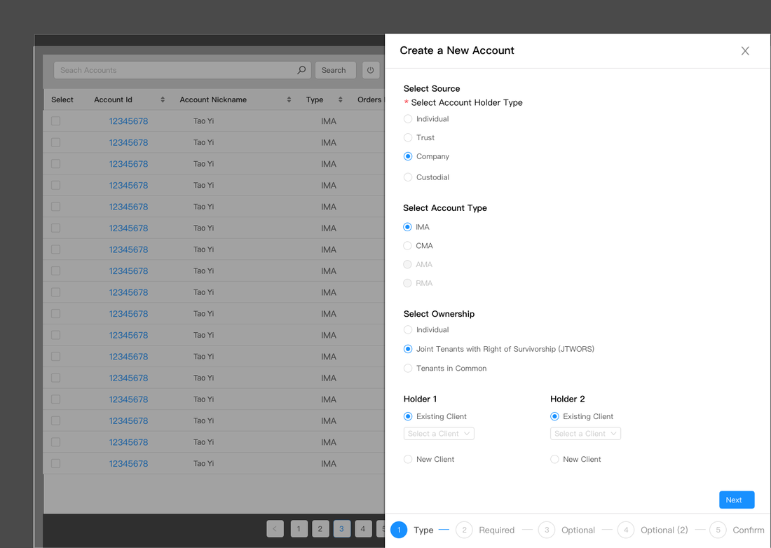
Open a New Account Step 1
|
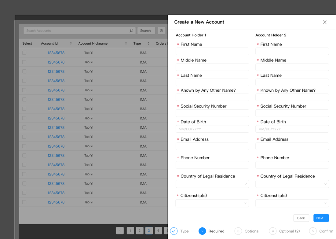
Open a New Account Step 2
|
Open a New Account Step 3
|
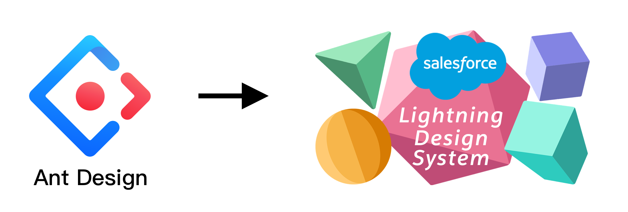
DESIGN SYSTEM CHANGE
4 weeks into the project, after I had completed many designs, there were development road blocks with the Ant Design system. In order to save time and streamline processes, the team decided to switch to Salesforce Lightning Design System (SLDS). SLDS was less code-heavy and provided a more unified experience, but this also meant redesigning everything from scratch. Although this was a setback to the timeline, I adapted quickly and was excited to gain experience with a new and widely used design system.
NEW DESIGN
In order to adapt the design, I analyzed the corporate branding guidelines for Fortamus and found ways to merge them within the new design system. I also had to adapt all of the icons to the SLDS icon set. The design changed quite drastically from a solid blue background and left global navigation, to a very light aesthetic with a top navigation. SLDS uses a centered modal structure, so I revised the screens, and coordinated with the developer to make sure the design elements and layout were consistent with the system.
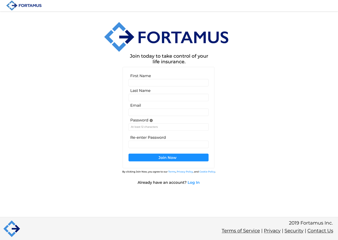
Client Sign Up
|
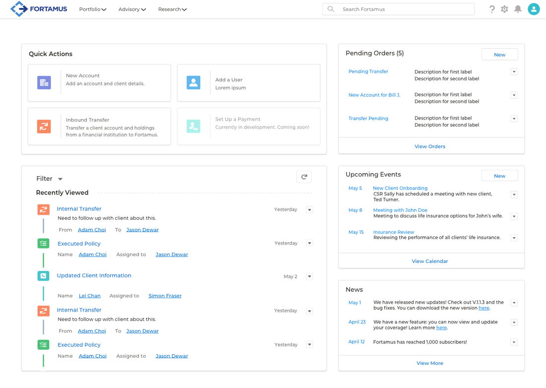
Advisor Home
|
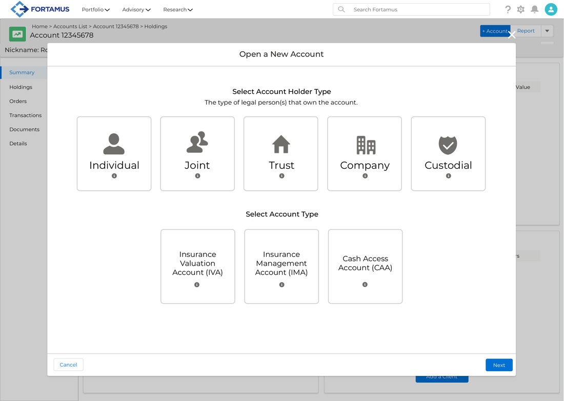
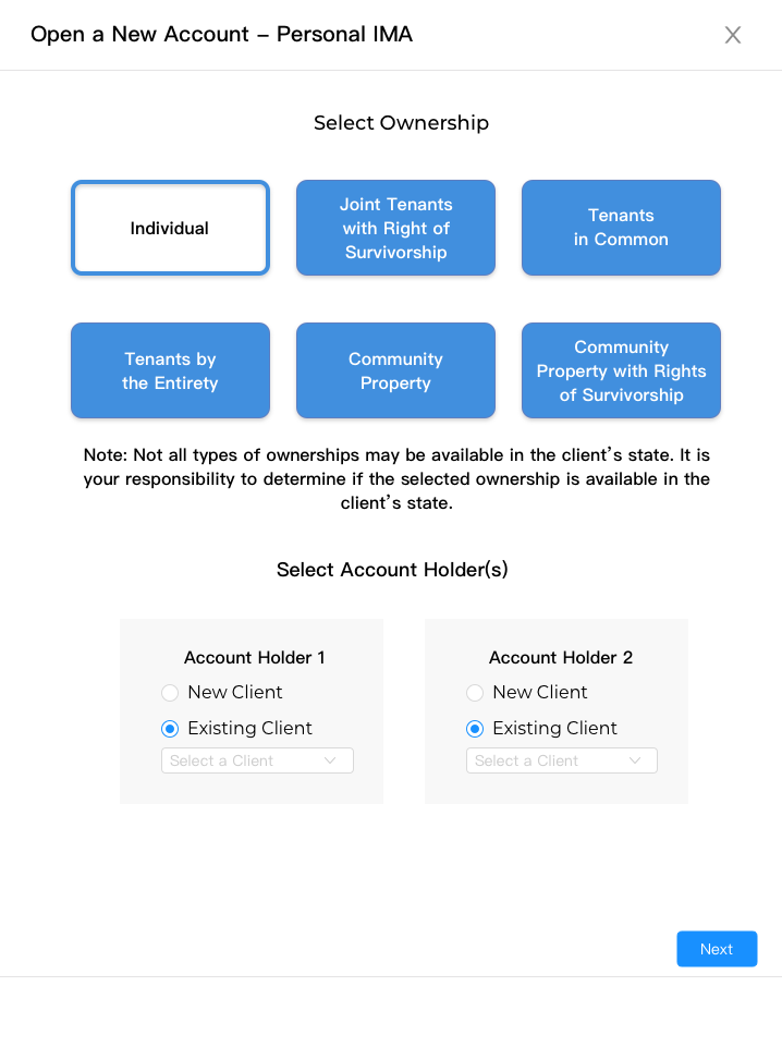
Open a New Account Step 1
|
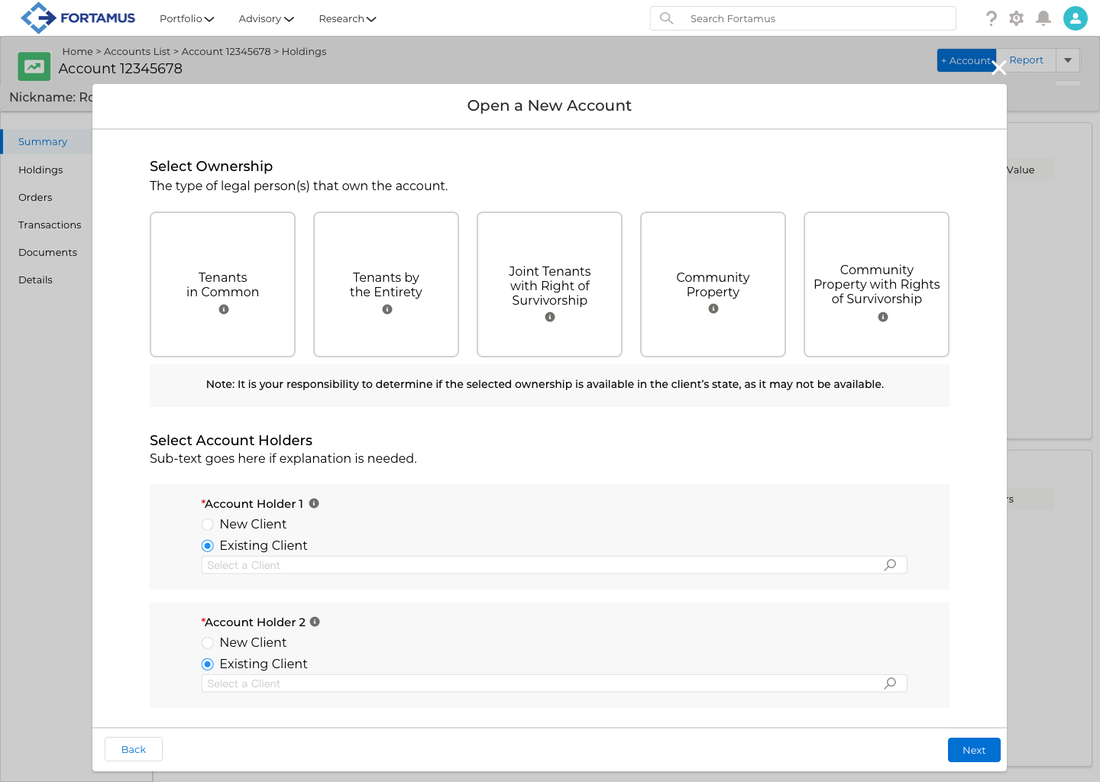
Open a New Account Step 2
|
PROTOTYPE
Open New Account Flow
Completing Orders
RESULTS
- Over 80 high fidelity wireframes were designed, covering multiple flows, views, and features.
- MVP was ready for development.
- Prototype was completed to start usability testing.
RECOMMENDATIONS
- Conduct user research and usability testing to further refine product design.
- Test product on financial advisors, administrative staff and clients, to ensure language is clear and makes sense to all users.
- Unify the branding and appearance of redesigned platform with marketing website, for brand cohesion.
KEY TAKEAWAYS
It was great to experience startup culture and be able to influence a product's design from the beginning. Working directly with the business and product owner helped me to understand the business aspect of the product and gain valuable skills interacting with senior management. I learned how to understand and communicate with developers, making sure my designs align with their capabilities and constraints. Lastly, I developed my wireframing skills and UI design using multiple design systems. Moving forward, I want to continue to expand my UI Design skills and gain more experience with different interfaces.